
Peach color is used in the interior not too often, but in vain, because this shade causes calm and joy. Researchers note that peach is associated with softness, lightness and femininity, causes a feeling of harmony and uplifting. It is great for any room.
Unlike the West, the East actively uses this shade in the interior. And in northern conditions, such a color is even more necessary, because it helps to create a sunny atmosphere even on the longest winter days.
Content
How to choose hue saturation
Peach is a cross between yellow, orange and pink. However, the peach group includes several different shades that differ in saturation, brightness.
Read more: Olive color in the interior - the best ideas
Experts recommend using shades as follows:
- Peach with a predominance of white is suitable for lounges. He is not provocative, allows you to relax. If you add it with white accents, you will visually expand the space.
- A shade with a predominance of pink is best used in the room of a teenage girl. It blends better with other shades than pure pink, but it still creates an atmosphere of femininity.
- Color with a slant in the sand is perfect for a child's room. He will not overload the vision of a newborn baby and at the same time stimulates a positive attitude of mother.
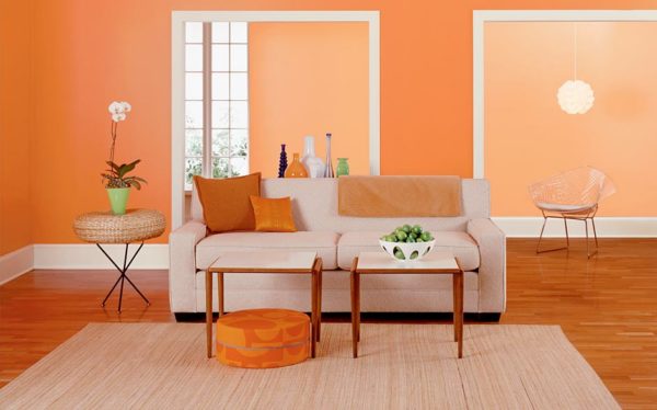
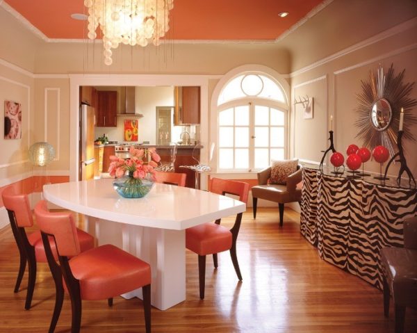
- It is better to use a bright palette with an admixture of orange in the kitchen as an accent, for example, to coat one wall panel with such paint. Also, the shade is suitable for furniture, but you should not use it as the main one.
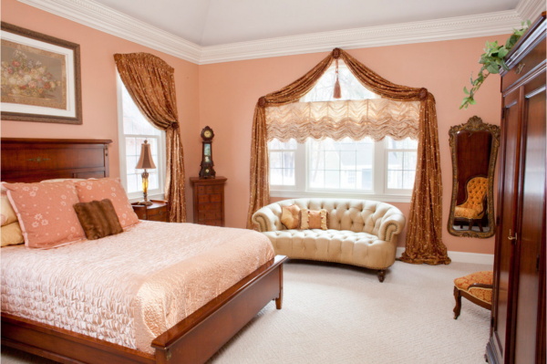
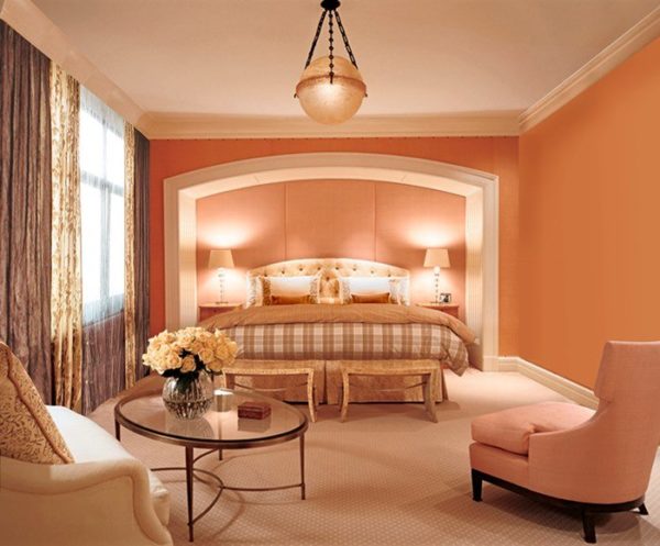
- Pure peach is better to use in the bedroom: it relaxes, increases the feeling of comfort, pleases the eye even on a cloudy morning, allowing you to wake up faster.
Before tinting the paint in the interior store, you can request an additional recommendation from a professional, specifying for what purposes the repair is carried out.
Peach color in the interior of various rooms
Peach can be used in almost any room. Experts made detailed recommendations on how to use it in different rooms and what to combine with.
Read more: Pink color in the interior - how not to make mistakes?
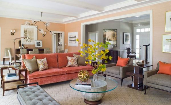
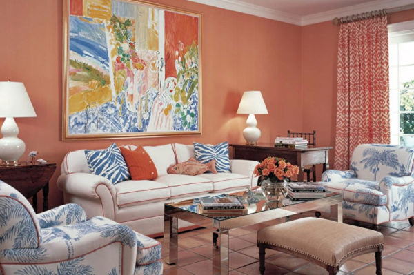
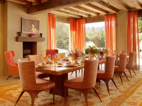
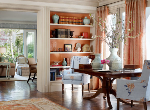
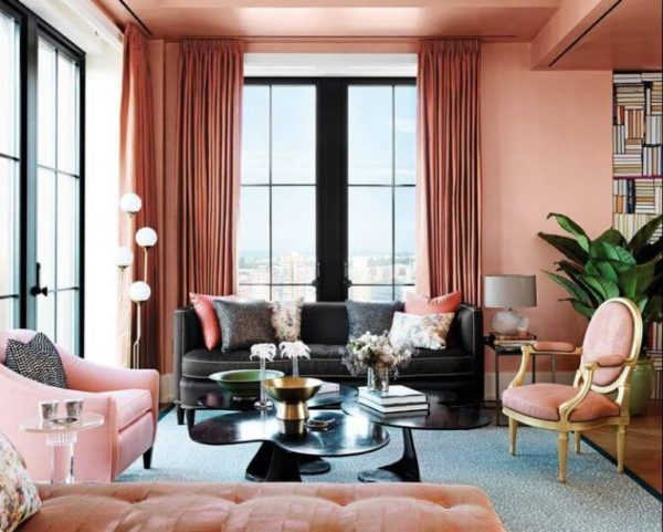
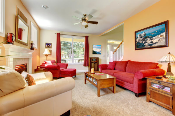
Living room
It is best to use light colors. Peach should be free of screaming red. Can be diluted with soft beige.
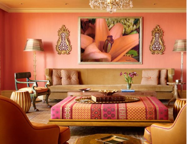
It is recommended to complement the interior with a set of natural wood (coffee table, chairs, rattan sofa). So the situation will be more sunny, with a reference to the East.
The tree should be saturated, but not too dark - caramel, nut, chocolate. Gray oak and ash will not work, but white oak is not forbidden.
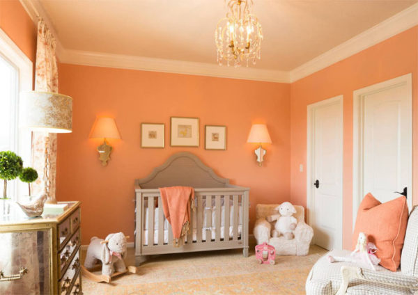
Children
In the nursery for the smallest, it is better to limit yourself to painting the walls with soft peach with the addition of beige or sand.
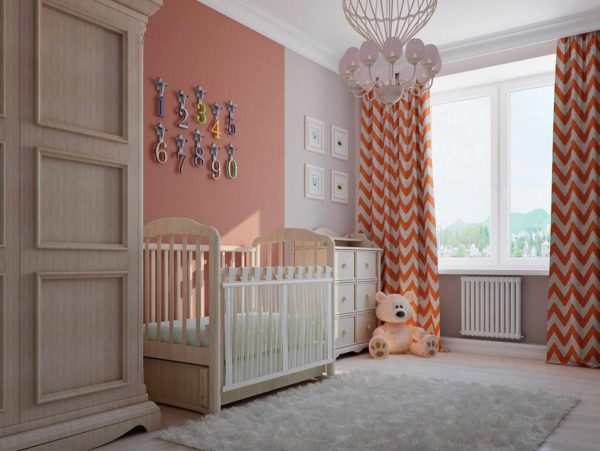
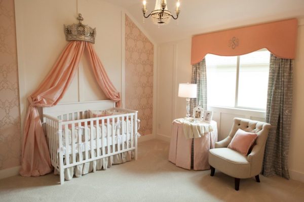
As the baby grows, you can add bright accents, but make sure that your visual perception is not overloaded. From 5-6 months, you can add individual toys, and from a year - padded stools, pillows, plastic highchairs.
If the walls are painted with peach, then furniture and toys are best to choose beige, orange, white.
Read more: Kitchen apron - the best ideas of 2019
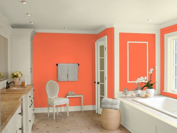
Bathroom
You can’t go too far in the bathroom. Too bright shades will look tasteless or bore your eyes, but in the bathroom they prefer to relax.
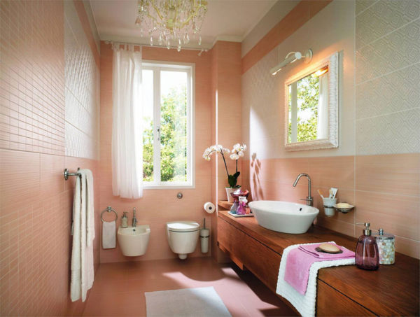
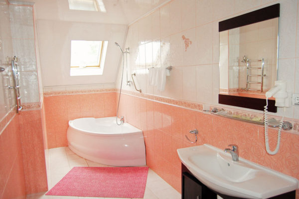
The ideal choice is a soft shade with a predominance of orange.In the interior they like to use tiles of this color, covering her walls and floor.
In this color, you can also design the base of the bath. But with a sink and accessories you should not overdo it. If the owner is going to purchase plumbing of this shade, then the walls are best done light, not peach.
The main mistakes when using peach
Peach color is combined with the following shades:
- coral (the whole set of soft shades from red to pink and orange);
- gold;
- white:
- nutty, caramel;
- beige;
- Orange;
- dark blue or not screaming turquoise;
- pink.
Read more: The library at home is fashionable! 22 design ideas
However, in the interior there are often other combinations that hurt the eye. The main mistakes:
- Use cold shades. Violet, green is better to exclude. Blue and cyan use within certain limits.
- The emphasis is shifted from peach to another bright shade. The color of the peach should be solo, that is, the main thing in terms of brightness and quantity. If other combinations interrupt it, the interior becomes tasteless.
- Wrong lighting selection. In order for the peach to play, you need to take care of a good spotlight, which will emphasize it at any time of the day.
Color is quite difficult to use. Perhaps if you can’t create a beautiful design project yourself, you will have to resort to the help of professional designers.
Alas, no comments yet. Be the first!